Plots
Plots are composed of multiple components.
- Y-axis:
This is a container and is the parent of all the data series that are added to the plot. The plot can have multiple Y-axis at one time (up to 3).
- X-axis:
This is the x data scale (only 1 x axis is allowed).
- Series:
These are the containers for the data you wish to display. Data series need to be added as a child of a Y-axis to be displayed on the plot. There are many different types of data series avaliable. Series also can contain UI Items that will be displayed when right-clicking the series label in the legend as a context menu.
- Legend (optional):
This is a normal legend and alos allows the user to toggle which data series are visible.
- Plots have some functionality built in:
- Toggle Data Series:
Click on the legend name of the desired data series to toggle
- Settings:
Double Right Click
- Pan Plot:
Click & Drag on plot
- Pan Axis:
Click & Drag on Axis
- Zoom:
Scroll Mouse Wheel
- Zoom Axis:
Hover Axis & Scroll Mouse Wheel
- Zoom Region:
Right Click & Drag
- Zoom Extents:
Double Click
- Zoom Axis Area:
Shift + Right Click & Drag
import dearpygui.dearpygui as dpg
from math import sin

dpg.create_context()

# creating data
sindatax = []
sindatay = []
for i in range(0, 500):
    sindatax.append(i / 1000)
    sindatay.append(0.5 + 0.5 * sin(50 * i / 1000))

with dpg.window(label="Tutorial"):
    # create plot
    with dpg.plot(label="Line Series", height=400, width=400):
        # optionally create legend
        dpg.add_plot_legend()

        # REQUIRED: create x and y axes
        dpg.add_plot_axis(dpg.mvXAxis, label="x")
        dpg.add_plot_axis(dpg.mvYAxis, label="y", tag="y_axis")

        # series belong to a y axis
        dpg.add_line_series(sindatax, sindatay, label="0.5 + 0.5 * sin(x)", parent="y_axis")

dpg.create_viewport(title='Custom Title', width=800, height=600)
dpg.setup_dearpygui()
dpg.show_viewport()
dpg.start_dearpygui()
dpg.destroy_context()
Updating Series Data
- You can change a series on a plot by
setting the series value
deleting that specific series item from they y-axis and adding it again
deleting all the series items from they y-axis and adding that specific series again
import dearpygui.dearpygui as dpg
from math import sin, cos

dpg.create_context()

sindatax = []
sindatay = []
for i in range(0, 500):
    sindatax.append(i / 1000)
    sindatay.append(0.5 + 0.5 * sin(50 * i / 1000))

def update_series():

    cosdatax = []
    cosdatay = []
    for i in range(0, 500):
        cosdatax.append(i / 1000)
        cosdatay.append(0.5 + 0.5 * cos(50 * i / 1000))
    dpg.set_value('series_tag', [cosdatax, cosdatay])
    dpg.set_item_label('series_tag', "0.5 + 0.5 * cos(x)")

with dpg.window(label="Tutorial", tag="win"):
    dpg.add_button(label="Update Series", callback=update_series)
    # create plot
    with dpg.plot(label="Line Series", height=400, width=400):
        # optionally create legend
        dpg.add_plot_legend()

        # REQUIRED: create x and y axes
        dpg.add_plot_axis(dpg.mvXAxis, label="x")
        dpg.add_plot_axis(dpg.mvYAxis, label="y", tag="y_axis")

        # series belong to a y axis
        dpg.add_line_series(sindatax, sindatay, label="0.5 + 0.5 * sin(x)", parent="y_axis", tag="series_tag")

dpg.create_viewport(title='Custom Title', width=800, height=600)
dpg.setup_dearpygui()
dpg.show_viewport()
dpg.start_dearpygui()
dpg.destroy_context()
Axis Limits
The following commands can be used to control the plot axes limits
set_axis_limits(…)
get_axis_limits(…)
set_axis_limits_auto(…)
fit_axis_data(…)
set_axis_limits_constraints(…)
reset_axis_limits_constraints(…)
set_axis_zoom_constraints(…)
reset_axis_zoom_constraints(…)
An example demonstrating some of this can be found below:
import dearpygui.dearpygui as dpg
dpg.create_context()
with dpg.window(label="Tutorial", width=400, height=400):
with dpg.group(horizontal=True):
dpg.add_button(label="fit y", callback=lambda: dpg.fit_axis_data("y_axis"))
dpg.add_button(label="unlock x limits", callback=lambda: dpg.set_axis_limits_auto("x_axis"))
dpg.add_button(label="unlock y limits", callback=lambda: dpg.set_axis_limits_auto("y_axis"))
dpg.add_button(label="print limits x", callback=lambda: print(dpg.get_axis_limits("x_axis")))
dpg.add_button(label="print limits y", callback=lambda: print(dpg.get_axis_limits("y_axis")))
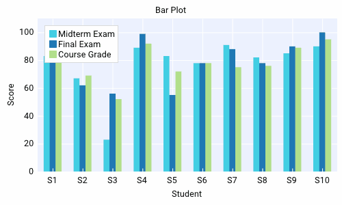
with dpg.plot(label="Bar Series", height=-1, width=-1):
dpg.add_plot_legend()
# create x axis
dpg.add_plot_axis(dpg.mvXAxis, label="Student", no_gridlines=True, tag="x_axis")
dpg.set_axis_limits(dpg.last_item(), 9, 33)
dpg.set_axis_ticks(dpg.last_item(), (("S1", 11), ("S2", 21), ("S3", 31)))
# create y axis
dpg.add_plot_axis(dpg.mvYAxis, label="Score", tag="y_axis")
dpg.set_axis_limits("y_axis", 0, 110)
# add series to y axis
dpg.add_bar_series([10, 20, 30], [100, 75, 90], label="Final Exam", weight=1, parent="y_axis")
dpg.add_bar_series([11, 21, 31], [83, 75, 72], label="Midterm Exam", weight=1, parent="y_axis")
dpg.add_bar_series([12, 22, 32], [42, 68, 23], label="Course Grade", weight=1, parent="y_axis")
dpg.create_viewport(title='Custom Title', width=800, height=600)
dpg.setup_dearpygui()
dpg.show_viewport()
dpg.start_dearpygui()
dpg.destroy_context()
Custom Axis Labels
Custom labels can be set per axis using
set_axis_ticks. They can be reset with
reset_axis_ticks.
An example can be found below
import dearpygui.dearpygui as dpg

dpg.create_context()

with dpg.window(label="Tutorial", width=400, height=400):
    with dpg.plot(label="Bar Series", height=-1, width=-1):
        dpg.add_plot_legend()

        # create x axis
        dpg.add_plot_axis(dpg.mvXAxis, label="Student", no_gridlines=True)
        dpg.set_axis_ticks(dpg.last_item(), (("S1", 11), ("S2", 21), ("S3", 31)))

        # create y axis
        dpg.add_plot_axis(dpg.mvYAxis, label="Score", tag="yaxis_tag")

        # add series to y axis
        dpg.add_bar_series([10, 20, 30], [100, 75, 90], label="Final Exam", weight=1, parent="yaxis_tag")
        dpg.add_bar_series([11, 21, 31], [83, 75, 72], label="Midterm Exam", weight=1, parent="yaxis_tag")
        dpg.add_bar_series([12, 22, 32], [42, 68, 23], label="Course Grade", weight=1, parent="yaxis_tag")

dpg.create_viewport(title='Custom Title', width=800, height=600)
dpg.setup_dearpygui()
dpg.show_viewport()
dpg.start_dearpygui()
dpg.destroy_context()
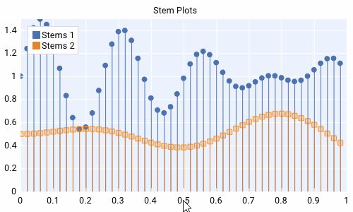
Multiple Y Axes
Plots can contain up to Three Y-axis for different data that needs a different scale.
import dearpygui.dearpygui as dpg
from math import sin

dpg.create_context()

sindatax = []
sindatay = []
for i in range(0, 100):
    sindatax.append(i / 100)
    sindatay.append(0.5 + 0.5 * sin(50 * i / 100))

with dpg.window(label="Tutorial", width=400, height=400):
    with dpg.plot(label="Multi Axes Plot", height=400, width=-1):
        dpg.add_plot_legend()

        # create x axis
        dpg.add_plot_axis(dpg.mvXAxis, label="x")

        # create y axis 1
        dpg.add_plot_axis(dpg.mvYAxis, label="y1")
        dpg.add_line_series(sindatax, sindatay, label="y1 lines", parent=dpg.last_item())

        # create y axis 2
        dpg.add_plot_axis(dpg.mvYAxis2, label="y2")
        dpg.add_stem_series(sindatax, sindatay, label="y2 stem", parent=dpg.last_item())

        # create y axis 3
        dpg.add_plot_axis(dpg.mvYAxis3, label="y3 scatter")
        dpg.add_scatter_series(sindatax, sindatay, label="y3", parent=dpg.last_item())

dpg.create_viewport(title='Custom Title', width=800, height=600)
dpg.setup_dearpygui()
dpg.show_viewport()
dpg.start_dearpygui()
dpg.destroy_context()
Annotations
Annotations can be used to mark locations on a plot.
Annotations are owned by the plot and their coordinates correspond to the 1st y axis.
They are clamped by default.
import dearpygui.dearpygui as dpg
from math import sin

dpg.create_context()


sindatax = []
sindatay = []
for i in range(0, 100):
    sindatax.append(i / 100)
    sindatay.append(0.5 + 0.5 * sin(50 * i / 100))

with dpg.window(label="Tutorial", width=400, height=400):
    with dpg.plot(label="Annotations", height=-1, width=-1):
        dpg.add_plot_legend()
        dpg.add_plot_axis(dpg.mvXAxis, label="x")
        dpg.add_plot_axis(dpg.mvYAxis, label="y")
        dpg.add_line_series(sindatax, sindatay, label="0.5 + 0.5 * sin(x)", parent=dpg.last_item())

        # annotations belong to the plot NOT axis
        dpg.add_plot_annotation(label="BL", default_value=(0.25, 0.25), offset=(-15, 15), color=[255, 255, 0, 255])
        dpg.add_plot_annotation(label="BR", default_value=(0.75, 0.25), offset=(15, 15), color=[255, 255, 0, 255])
        dpg.add_plot_annotation(label="TR not clampled", default_value=(0.75, 0.75), offset=(-15, -15),
                                color=[255, 255, 0, 255], clamped=False)
        dpg.add_plot_annotation(label="TL", default_value=(0.25, 0.75), offset=(-15, -15), color=[255, 255, 0, 255])
        dpg.add_plot_annotation(label="Center", default_value=(0.5, 0.5), color=[255, 255, 0, 255])

dpg.create_viewport(title='Custom Title', width=800, height=600)
dpg.setup_dearpygui()
dpg.show_viewport()
dpg.start_dearpygui()
dpg.destroy_context()
Drag Points and Lines
Drag lines/points are owned by the plot and their coordinates correspond to the 1st y axis. These items can be moved by clicking and dragging.
You can also set a callback to be ran when they are interacted with!
import dearpygui.dearpygui as dpg

dpg.create_context()

def print_val(sender):
    print(dpg.get_value(sender))

with dpg.window(label="Tutorial", width=400, height=400):
    with dpg.plot(label="Drag Lines/Points", height=-1, width=-1):
        dpg.add_plot_legend()
        dpg.add_plot_axis(dpg.mvXAxis, label="x")
        dpg.set_axis_limits(dpg.last_item(), -5, 5)
        dpg.add_plot_axis(dpg.mvYAxis, label="y")
        dpg.set_axis_limits(dpg.last_item(), -5, 5)

        # drag lines/points belong to the plot NOT axis
        dpg.add_drag_line(label="dline1", color=[255, 0, 0, 255], default_value=2.0, callback=print_val)
        dpg.add_drag_line(label="dline2", color=[255, 255, 0, 255], vertical=False, default_value=-2, callback=print_val)
        dpg.add_drag_point(label="dpoint1", color=[255, 0, 255, 255], default_value=(1.0, 1.0), callback=print_val)
        dpg.add_drag_point(label="dpoint2", color=[255, 0, 255, 255], default_value=(-1.0, 1.0), callback=print_val)

dpg.create_viewport(title='Custom Title', width=800, height=600)
dpg.setup_dearpygui()
dpg.show_viewport()
dpg.start_dearpygui()
dpg.destroy_context()
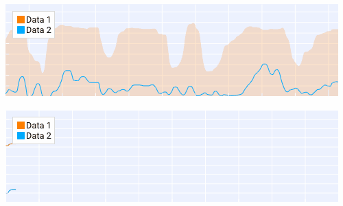
Querying
Querying allows the user to select a region of the plot by Ctrl + dragging the right mouse button and dragging five circles of the query rectangle with left mouse button.
Double left click inside a drag rect will remove it (if min_query_rects allows). If number of rects exceed max_query_rects when create new drag rect, it will replace the last one.
Since DearPyGui 2.0, query_mod changes to query_toggle_mod for swapping the Ctrl key above. query_button is removed, so dragging the right mouse button is hardcoded. min_query_rects, max_query_rects limit the number of drag rects.
Querying requires setting query to True when creating the plot.
The callback of the plot will run when the plot is being queried (dragging five circles). Or not using plot’s callback but drag rect’s callback dpg.add_drag_rect(callback=…).
All the query areas are sent through the app_data argument as ((x_min, y_min, x_max, y_max), (x_min, y_min, x_max, y_max), …).
It is also possible to poll the plot for the query areas by calling:
get_plot_query_rects and
Below is an example using the callback
import dearpygui.dearpygui as dpg
from math import sin

dpg.create_context()

sindatax = []
sindatay = []
for i in range(0, 100):
    sindatax.append(i / 100)
    sindatay.append(0.5 + 0.5 * sin(50 * i / 100))

with dpg.window(label="Tutorial", width=400, height=600):
    dpg.add_text("Ctrl and drag the right mouse button over the top plot!")


    def query(sender, app_data, user_data):
        # TODO: handle for when app_data is empty - IndexError: tuple index out of range.
        rect_0 = app_data[0]
        # other_rects = app_data[1:]
        dpg.set_axis_limits("xaxis_tag2", rect_0[0], rect_0[2])
        dpg.set_axis_limits("yaxis_tag2", rect_0[1], rect_0[3])


    # plot 1
    with dpg.plot(
        no_title=True, height=200, callback=query, query=True, no_menus=True, width=-1,
        min_query_rects=0, max_query_rects=3,
    ):
        dpg.add_plot_axis(dpg.mvXAxis, label="x")
        dpg.add_plot_axis(dpg.mvYAxis, label="y")
        dpg.add_line_series(sindatax, sindatay, parent=dpg.last_item())

    # plot 2
    with dpg.plot(no_title=True, height=200, no_menus=True, width=-1):
        dpg.add_plot_axis(dpg.mvXAxis, label="x1", tag="xaxis_tag2")
        dpg.add_plot_axis(dpg.mvYAxis, label="y1", tag="yaxis_tag2")
        dpg.add_line_series(sindatax, sindatay, parent="yaxis_tag2")

dpg.create_viewport(title='Custom Title', width=800, height=600)
dpg.setup_dearpygui()
dpg.show_viewport()
dpg.start_dearpygui()
dpg.destroy_context()
Custom Series
New in 1.6. Custom series allow you to control the way a series is rendered.
A custom series can currently have between 2 and 5 channels. A channel is an array/list of data. Each channel must be the same length. The first 2 channels and channel count are required arguments. Additional channels can be provided with the y1, y2, and y3 keywords. You must also set the “callback” keyword. The second argument will be provided by DPG as a list. The first item being useful information. The following items are the original data sent in but transformed into pixel space. The combination of all this information can be used to create a custom series. See simple example below:
import dearpygui.dearpygui as dpg

dpg.create_context()
dpg.create_viewport()
dpg.setup_dearpygui()

x_data = [0.0, 1.0, 2.0, 4.0, 5.0]
y_data = [0.0, 10.0, 20.0, 40.0, 50.0]

def callback(sender, app_data):

    _helper_data = app_data[0]
    transformed_x = app_data[1]
    transformed_y = app_data[2]
    #transformed_y1 = app_data[3] # for channel = 3
    #transformed_y2 = app_data[4] # for channel = 4
    #transformed_y3 = app_data[5] # for channel = 5
    mouse_x_plot_space = _helper_data["MouseX_PlotSpace"]   # not used in this example
    mouse_y_plot_space = _helper_data["MouseY_PlotSpace"]   # not used in this example
    mouse_x_pixel_space = _helper_data["MouseX_PixelSpace"]
    mouse_y_pixel_space = _helper_data["MouseY_PixelSpace"]
    dpg.delete_item(sender, children_only=True, slot=2)
    dpg.push_container_stack(sender)
    dpg.configure_item("demo_custom_series", tooltip=False)
    for i in range(0, len(transformed_x)):
        dpg.draw_text((transformed_x[i]+15, transformed_y[i]-15), str(i), size=20)
        dpg.draw_circle((transformed_x[i], transformed_y[i]), 15, fill=(50+i*5, 50+i*50, 0, 255))
        if mouse_x_pixel_space < transformed_x[i]+15 and mouse_x_pixel_space > transformed_x[i]-15 and mouse_y_pixel_space > transformed_y[i]-15 and mouse_y_pixel_space < transformed_y[i]+15:
            dpg.draw_circle((transformed_x[i], transformed_y[i]), 30)
            dpg.configure_item("demo_custom_series", tooltip=True)
            dpg.set_value("custom_series_text", "Current Point: " + str(i))
    dpg.pop_container_stack()

with dpg.window(label="Tutorial") as win:
    dpg.add_text("Hover an item for a custom tooltip!")
    with dpg.plot(label="Custom Series", height=400, width=-1):
        dpg.add_plot_legend()
        xaxis = dpg.add_plot_axis(dpg.mvXAxis)
        with dpg.plot_axis(dpg.mvYAxis):
            with dpg.custom_series(x_data, y_data, 2, label="Custom Series", callback=callback, tag="demo_custom_series"):
                dpg.add_text("Current Point: ", tag="custom_series_text")
            dpg.fit_axis_data(dpg.top_container_stack())

dpg.set_primary_window(win, True)
dpg.show_viewport()
dpg.start_dearpygui()
dpg.destroy_context()
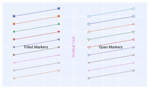
Colors and Styles
The color and styles of a plot and series can be changed using theme app item
See also
For more information on item values Themes
import dearpygui.dearpygui as dpg
from math import sin

dpg.create_context()

sindatax = []
sindatay = []
for i in range(0, 100):
    sindatax.append(i / 100)
    sindatay.append(0.5 + 0.5 * sin(50 * i / 100))
sindatay2 = []
for i in range(0, 100):
    sindatay2.append(2 + 0.5 * sin(50 * i / 100))

with dpg.window(label="Tutorial", width=500, height=400):
    # create a theme for the plot
    with dpg.theme(tag="plot_theme"):
        with dpg.theme_component(dpg.mvStemSeries):
            dpg.add_theme_color(dpg.mvPlotCol_Line, (150, 255, 0), category=dpg.mvThemeCat_Plots)
            dpg.add_theme_style(dpg.mvPlotStyleVar_Marker, dpg.mvPlotMarker_Diamond, category=dpg.mvThemeCat_Plots)
            dpg.add_theme_style(dpg.mvPlotStyleVar_MarkerSize, 7, category=dpg.mvThemeCat_Plots)

        with dpg.theme_component(dpg.mvScatterSeries):
            dpg.add_theme_color(dpg.mvPlotCol_Line, (60, 150, 200), category=dpg.mvThemeCat_Plots)
            dpg.add_theme_style(dpg.mvPlotStyleVar_Marker, dpg.mvPlotMarker_Square, category=dpg.mvThemeCat_Plots)
            dpg.add_theme_style(dpg.mvPlotStyleVar_MarkerSize, 4, category=dpg.mvThemeCat_Plots)

    # create plot
    with dpg.plot(tag="plot", label="Line Series", height=-1, width=-1):

        # optionally create legend
        dpg.add_plot_legend()

        # REQUIRED: create x and y axes
        dpg.add_plot_axis(dpg.mvXAxis, label="x")
        dpg.add_plot_axis(dpg.mvYAxis, label="y", tag="yaxis")

        # series belong to a y axis
        dpg.add_stem_series(sindatax, sindatay, label="0.5 + 0.5 * sin(x)", parent="yaxis", tag="series_data")
        dpg.add_scatter_series(sindatax, sindatay2, label="2 + 0.5 * sin(x)", parent="yaxis", tag="series_data2")

        # apply theme to series
        dpg.bind_item_theme("series_data", "plot_theme")
        dpg.bind_item_theme("series_data2", "plot_theme")

dpg.create_viewport(title='Custom Title', width=800, height=600)
dpg.setup_dearpygui()
dpg.show_viewport()
dpg.start_dearpygui()
dpg.destroy_context()
Colormaps
Under construction